Case Study - Feature ProjectVeterans
CLIENTNZ Post
ROLEVisual Communication Designer
SCOPEEnd-to-end project ownership
CONTRIBUTIONConcept Development, Stamp Design, Production Artwork, Stakeholder Collaboration, Final Delivery, Marketing Collateral
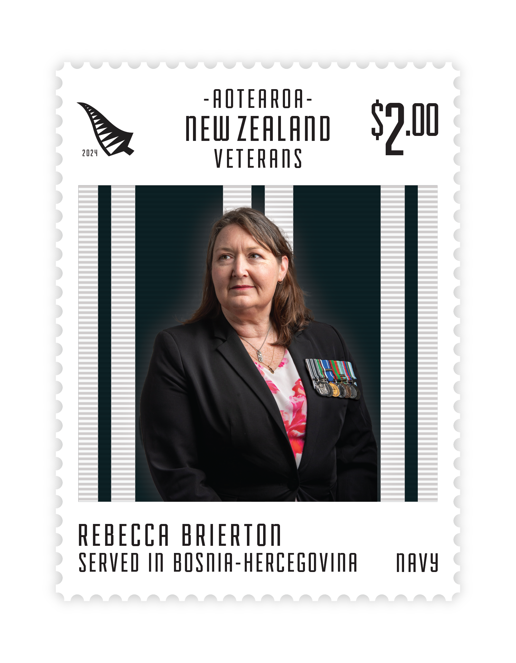
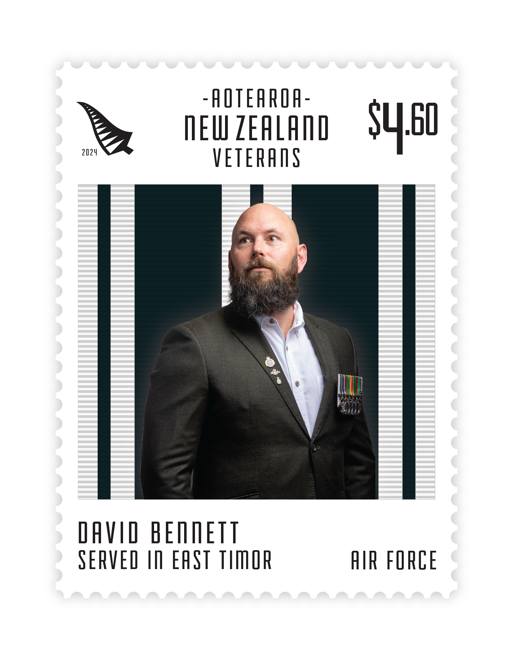
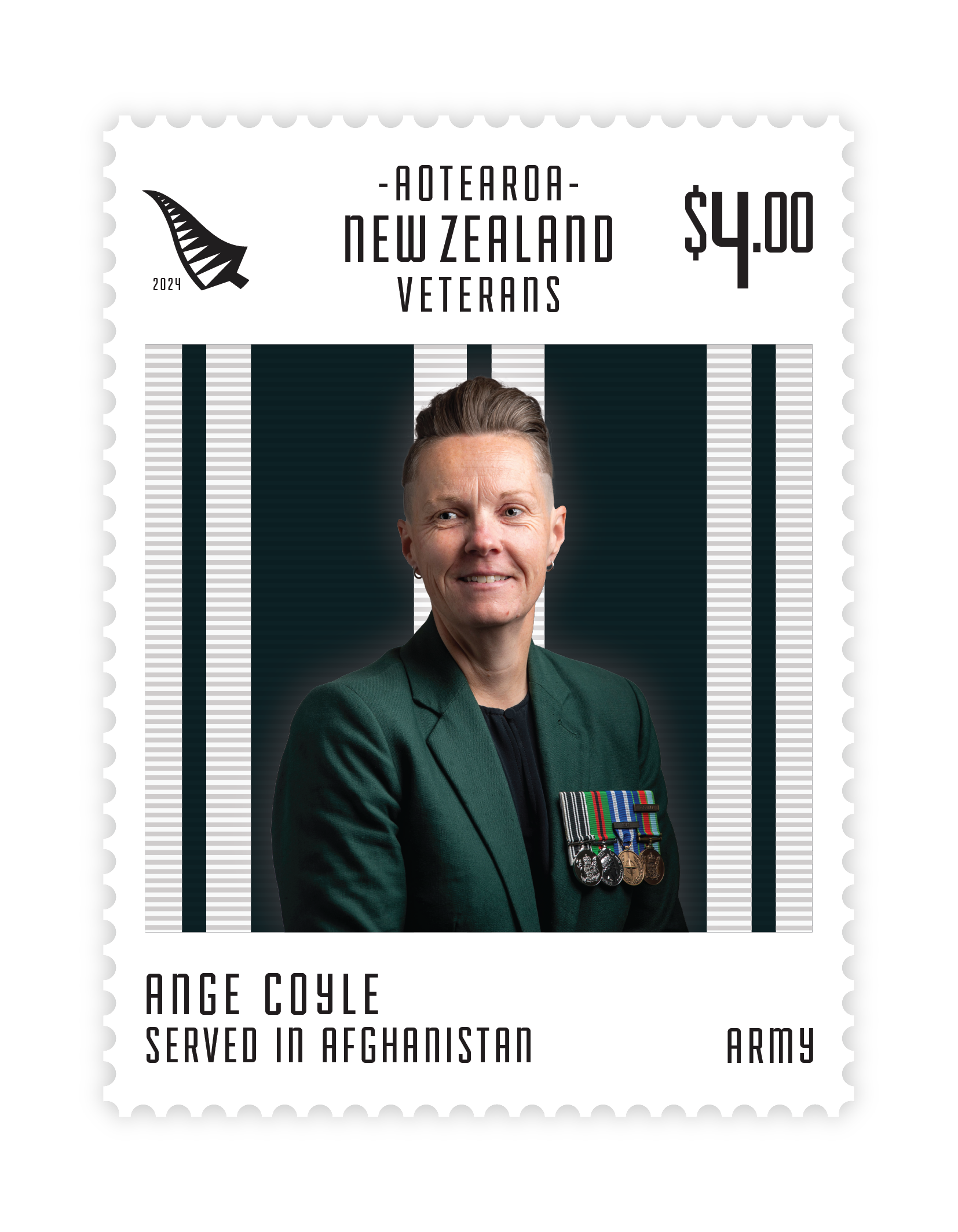
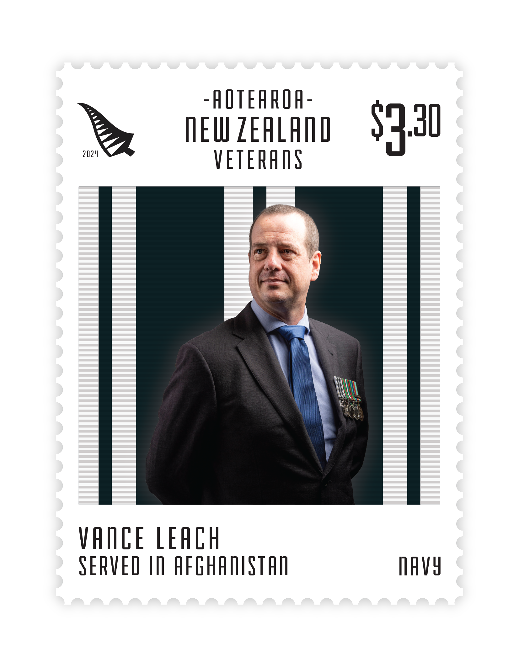
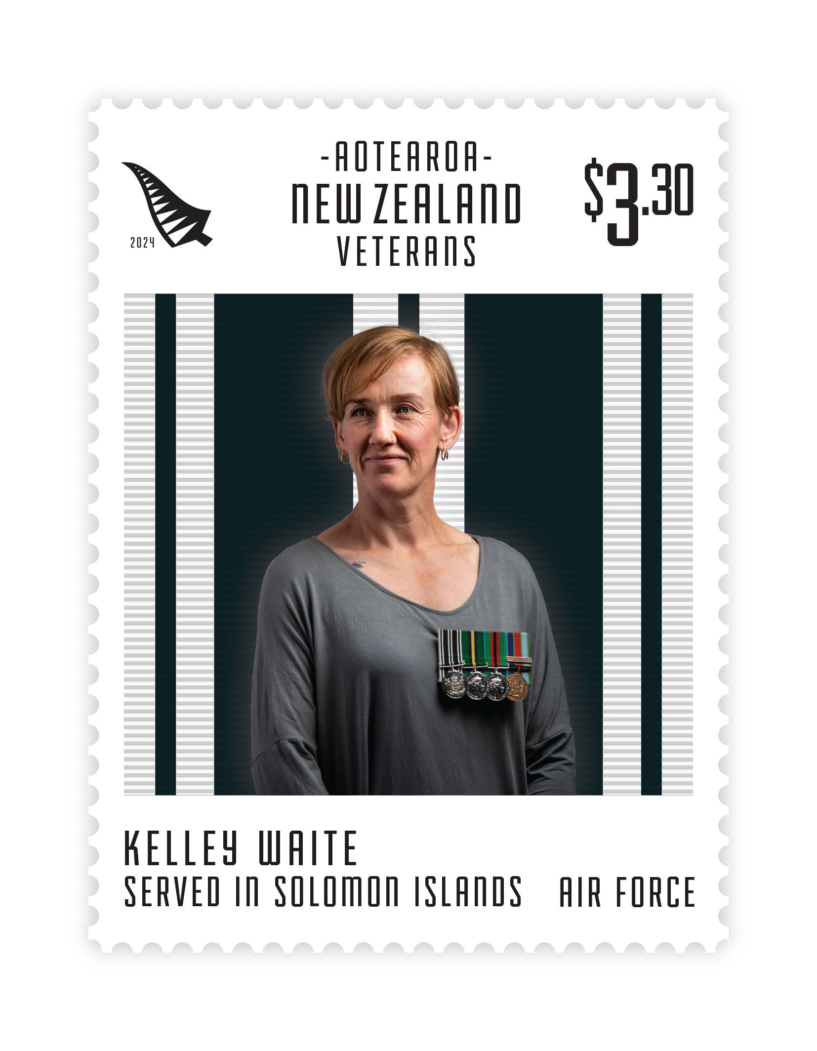
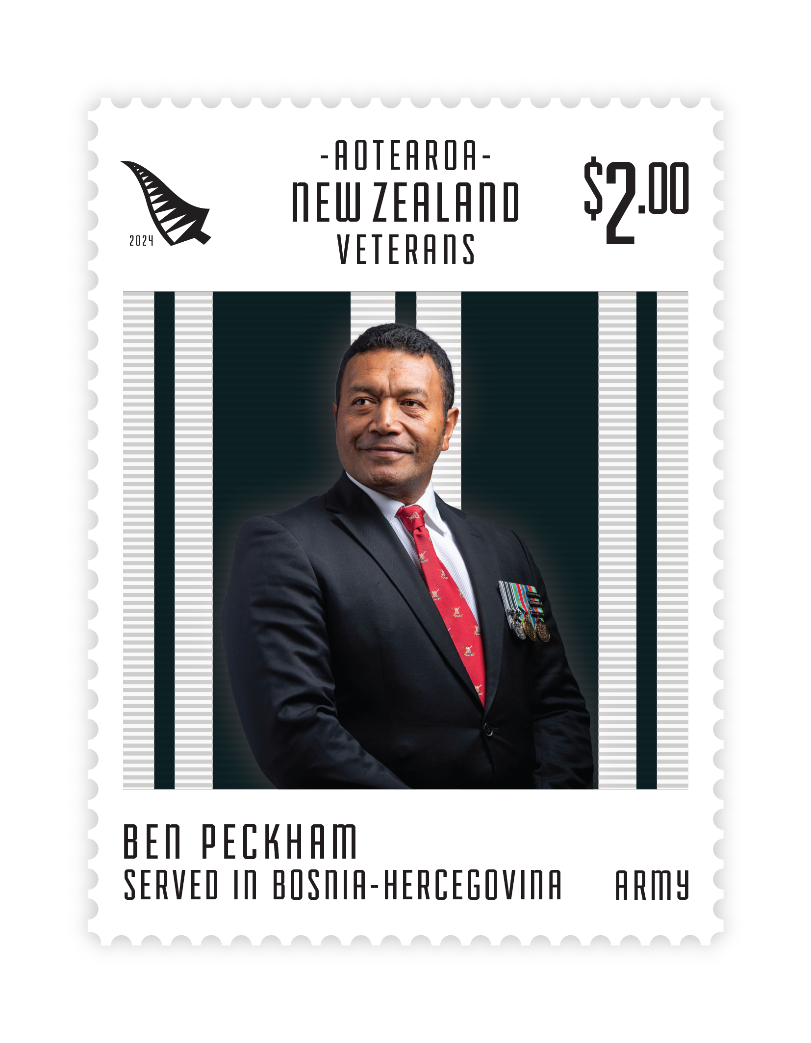
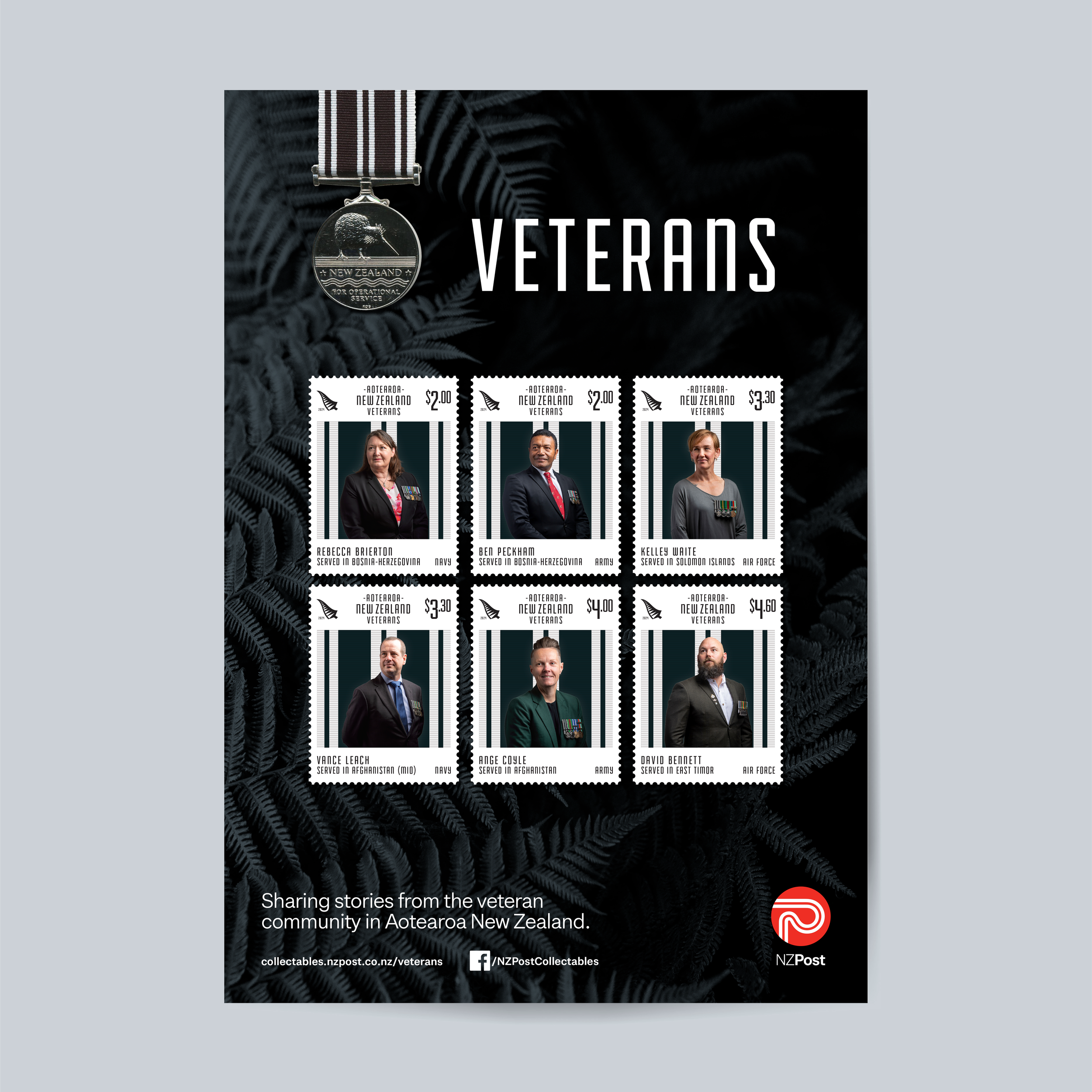
Veterans
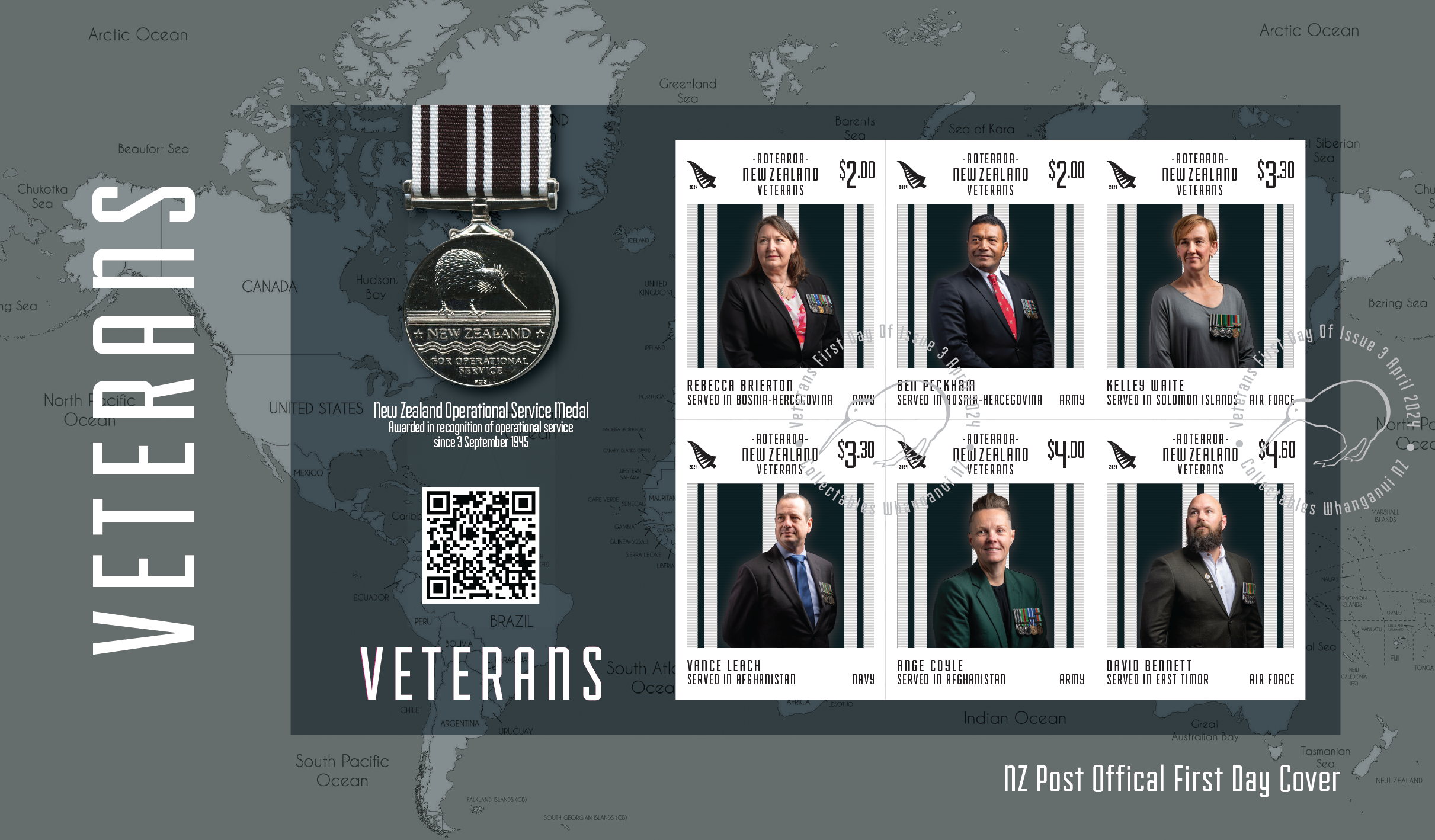
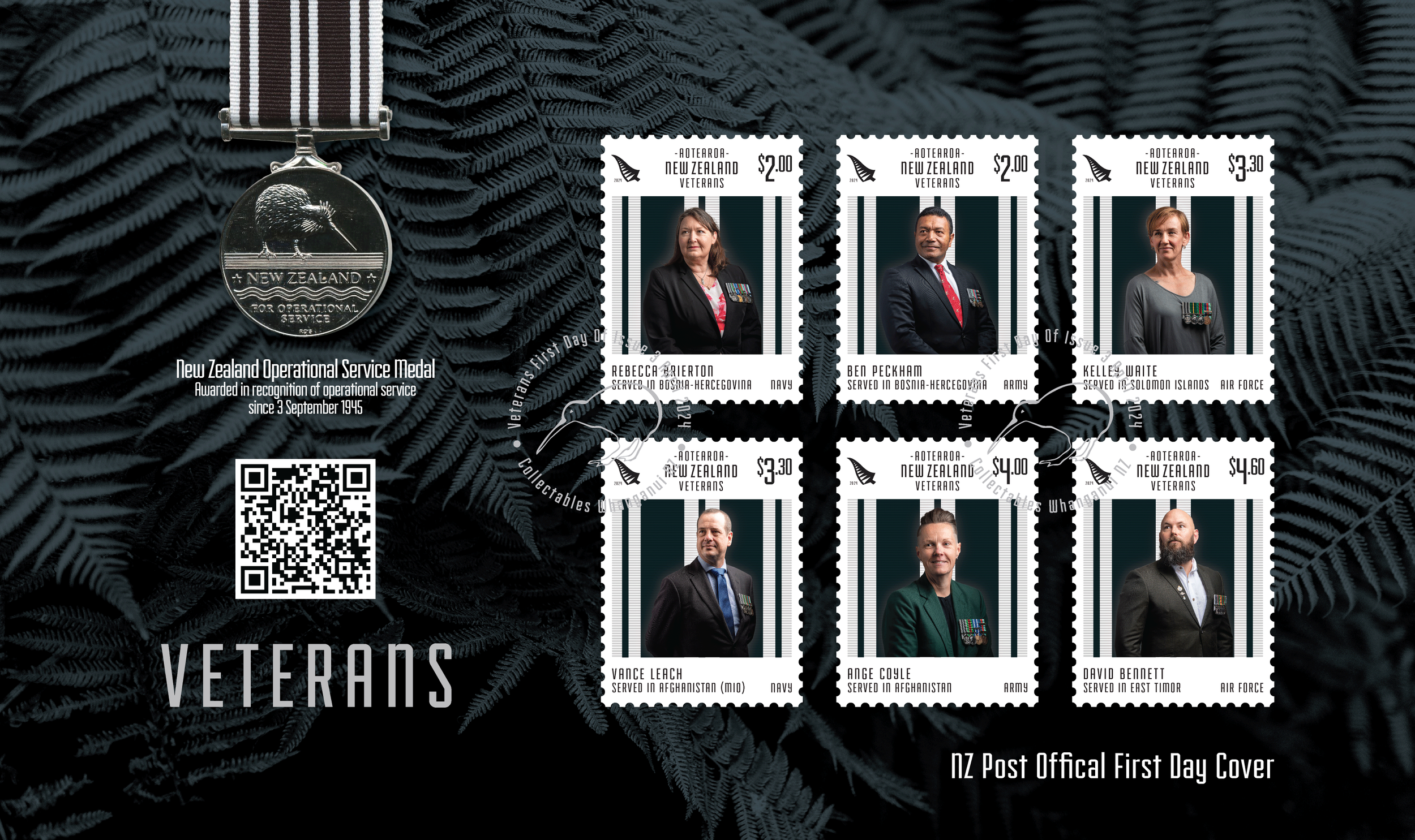
A six stamp issue designed to commemorate and celebrate New Zealand's Veterans. My goal was to challenge the stereotypical perception of what it means to be a Veteran in Aotearoa.
-
The main goal with this stamp issue was to combat the assumption that all veterans are old men. Many veterans aren’t retired from the workforce; they have left the New Zealand Defence Force and now live and work in our communities. They are ordinary people who at times in their lives performed an extraordinary service for their country.This project was a collaboration between NZ Post and Veteran Affairs, who were a fantastic resource when it came to sourcing Veteran's to feature. We also spoke to subject matter experts from the Ministry of Defence and other organisations to narrow down the conflicts and regions to include in this stamp issue.
-
For this stamp issue we needed to humanise Veterans, and photography was an excellent way to do this. Each stamp features a portrait style photograph of the selected subjects, where they are dressed in their everyday clothes with their medals pinned to their chests. This was an intentional choice, to remove the official uniforms, and showcase that really anyone could be a veteran - your neighbour, the local courier or even a friend. Diversity was also an essential consideration, we wanted to showcase different genders, ethnicities and ages across the three divisions of our defense force, again to highlight the core theme of the issue - anyone could be a veteran. Everyday people and their images are the core feature of this design and it was crucial that the photographs were empowering and true to the Veterans we featured.
-
Traditionally ANZAC and Veteran linked designs feature poppies and the colour red as widely recognised iconography. We wanted to create something different that was set apart from other ANZAC designs but still felt very Kiwi. We used the Operational Service Medal's black and white ribbon to set the style for the stamps, an intrinsically New Zealand colour scheme and a nod each of the featured veterans who were awarded this medal.Stamps are a technical product with a myriad of specifications that must be kept in mind when designing. Scale and non-negotiable copy such as denominations were an important factor to consider in the design process. There were several core features that were integral to the design of the stamp, the operational service medal, the region of conflict, and the division of service (army, navy, airforce) and the veterans name.
-
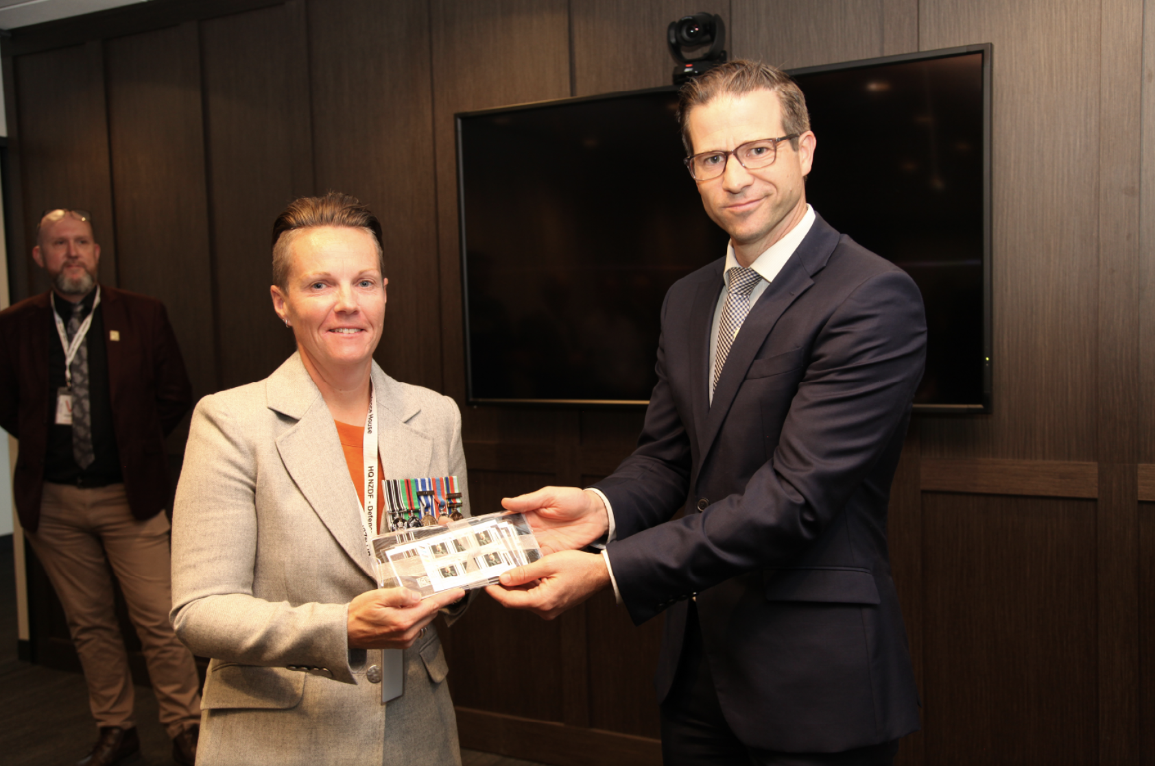
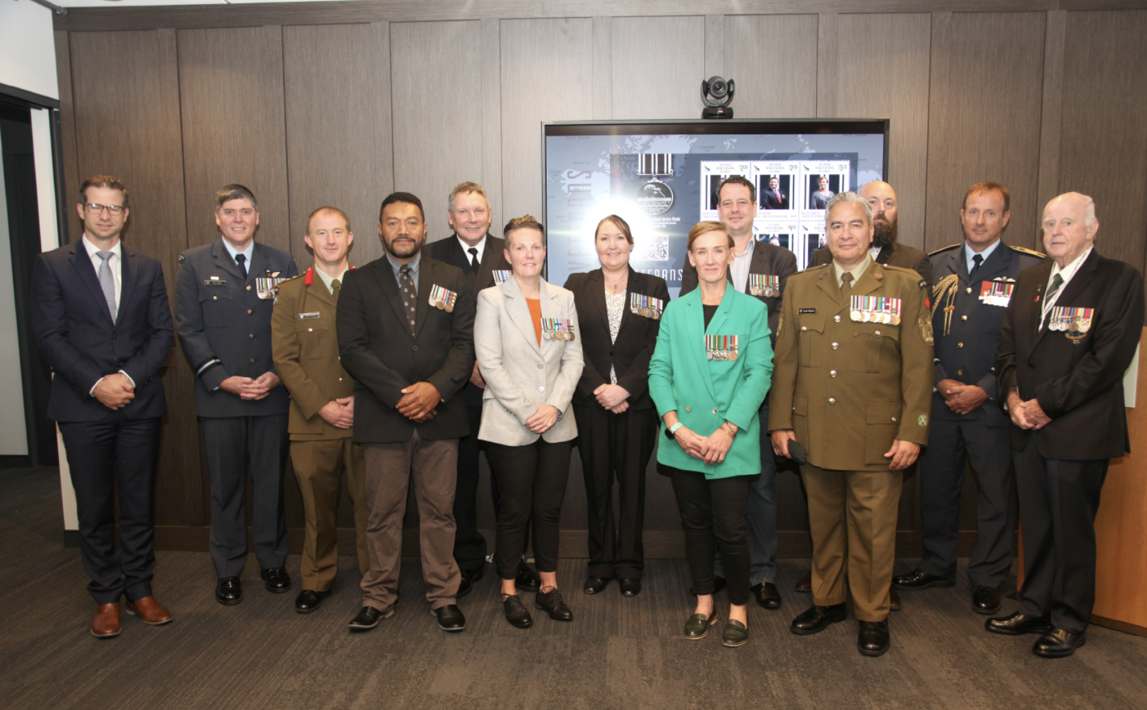
We were hosted by the Ministry of Defence to celebrate the launch of the stamp set. This was an incredibly moving experience, with the featured veteran's, their friends and family attending along with military officials.